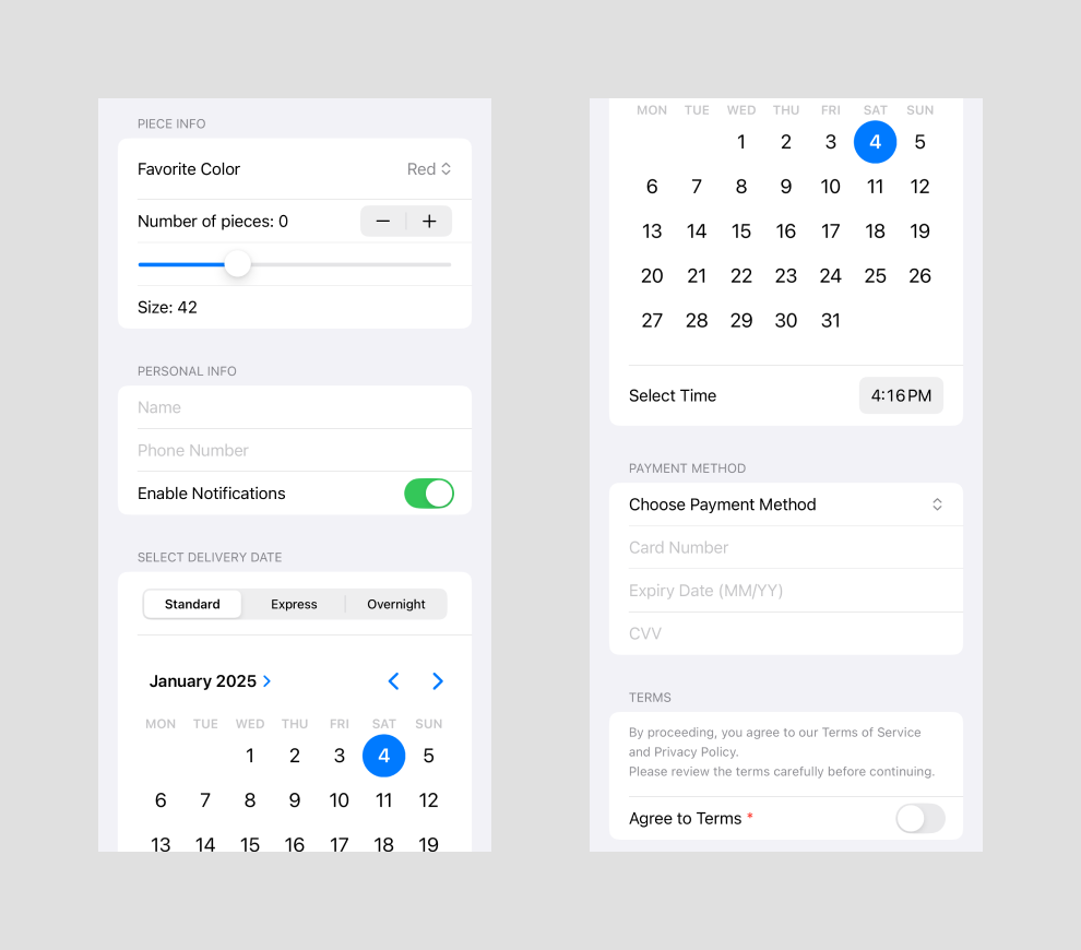
In this tutorial, we’ll build a checkout form using SwiftUI basic controls. The form demonstrates various SwiftUI components like Picker, TextField, DatePicker, and more, organized into sections for better clarity.
This article provides a quick overview of SwiftUI’s basic controls, showcasing their functionality through simple examples for demonstration purposes.
Each section addresses a specific part of a typical checkout process: selecting product options, providing personal info, choosing delivery details, and selecting a payment method. Let’s get started! 🚀
What We’ll Build
Our form includes the following sections:
1. Piece Info: Choose options like favorite color, number of pieces, and size.
2. Personal Info: Enter personal details and toggle notification preferences.
3. Delivery Info: Select delivery methods, date, and time.
4. Payment Method: Pick a payment method and provide details accordingly.
5. Terms: Review and agree to terms and conditions.
Step-by-Step Implementation
Piece Info section
Allow users to select a color, adjust the number of pieces, and set the size.
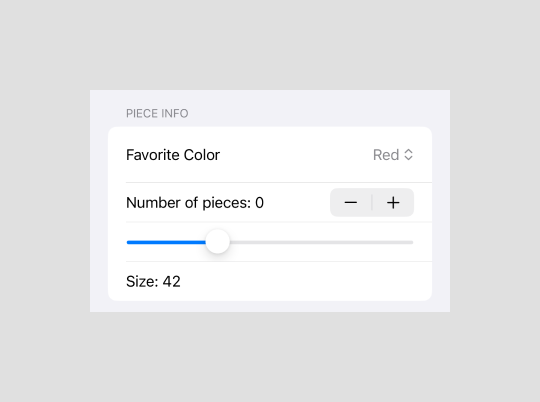
Section("Piece info") {
    Picker("Favorite Color", selection: $favoriteColor) {
        ForEach(favoriteColors, id: \.self) {
            Text($0)
        }
    }

    Stepper("Number of pieces: \(numberOfPieces)", value: $numberOfPieces)

    Slider(value: $size, in: 30...70, step: 1) {
        Text("Size")
    }

    Text("Size: \(Int(size))")
}
1. Picker
- Overview: A control for selecting from a set of mutually exclusive values.
- Example Usage: Used here to let the user pick their favorite color.
- Styles:
- Default
- Segmented
- Wheel
2. Stepper
- Overview: A control that performs increment and decrement actions.
- Example Usage: Usage: Used to adjust the number of pieces.
- Key Features:
- Dynamically updates a value.
- Can limit minimum and maximum bounds.
3. Slider
- Overview: A control for selecting a value from a bounded linear range of values.
- Example Usage: Allows users to adjust the size of the product.
- Key Features:
- Supports custom range.
- Can step through discrete intervals.
Personal Info section
Collect personal details and notification preferences.
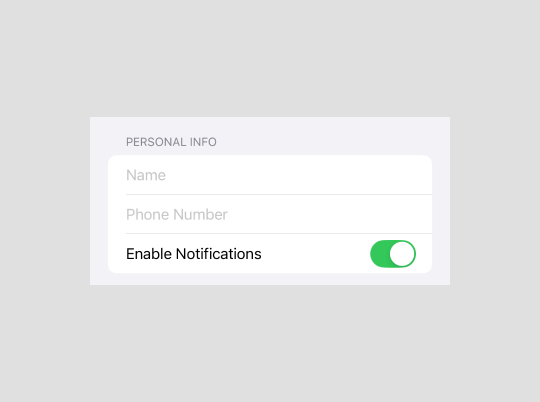
Section("Personal info") {
    TextField("Name", value: $nameComponents, format: .name(style: .long))
        .disableAutocorrection(true)
        .keyboardType(.namePhonePad)

    TextField("Phone Number", text: $phoneNumber)
        .keyboardType(.numberPad)

    Toggle("Enable Notifications", isOn: $enableNotifications)
}
1. TextField
- Overview: A control for entering and editing text.
- Example Usage: Used to capture user input such as name, phone number, or email.
- Key Features:
- Supports different keyboard types (e.g., email, number, name).
- Can be customized with placeholder text and modifiers.
2. Toggle
- Overview: A control for toggling between two states, typically “on” and “off”.
- Example Usage: Used for enabling or disabling notifications.
- Key Features:
- Simple and intuitive for binary choices.
- Can be styled with custom colors and sizes.
Delivery Info section
Allow users to pick delivery methods, dates, and times.
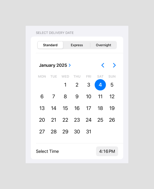
Section("Select delivery date") {
    Picker("Delivery method", selection: $deliveryMethod) {
        ForEach(deliveryMethods, id: \.self) {
            Text($0)
        }
    }
    .pickerStyle(.segmented)
    .padding(5)

    DatePicker("Select Date", selection: $deliveryDate, displayedComponents: .date)
        .datePickerStyle(.graphical)

    DatePicker("Select Time", selection: $deliveryTime, displayedComponents: .hourAndMinute)
}
DatePicker
- Overview: A control for selecting a specific date, time, or both.
- Example Usage: Used to choose delivery dates or times.
- Key Features:
- Supports different display styles.
- Can restrict date or time range with constraints.
- Provides options for date-only, time-only, or both.
- Styles for DatePicker:
- Default
- The standard appearance of the `DatePicker`.
- Adapts to the platform’s default UI style.
- Graphical
- Displays a visually rich calendar interface.
- Useful for showing the entire month view.
- Compact
- A minimal, dropdown-style interface for selecting a date or time.
- Ideal for saving space in forms.
- Wheel
- Shows a picker with spinning wheels for date and time selection.
- Often used in settings or configuration screens.
- Default
Payment Methods section
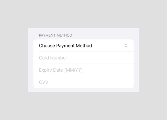
We define an enum to handle the available payment method options.
enum PaymentMethod: String, Identifiable, CaseIterable {
    case creditCard = "Credit Card"
    case payPal = "PayPal"
    case applePay = "Apple Pay"

    var id: String { rawValue }
}
The section layout changes dynamically based on the selected payment method, adjusting its content to meet the requirements of the chosen method.
Section("Payment Method") {
    Picker("Choose Payment Method", selection: $paymentMethod) {
        ForEach(PaymentMethod.allCases) {
            Text($0.rawValue)
        }
    }

    switch paymentMethod {
    case .creditCard:
        TextField("Card Number", text: $cardNumber)
            .keyboardType(.numberPad)

        TextField("Expiry Date (MM/YY)", text: $expiryDate)
            .keyboardType(.numbersAndPunctuation)

        TextField("CVV", text: $cvv)
            .keyboardType(.numberPad)
    case .payPal:
        TextField("PayPal Email", text: $email)
            .keyboardType(.emailAddress)
    case .applePay:
        TextField("Name on Apple Pay", text: $applePayName)
    }
}
Terms section
Display terms and conditions and a toggle for agreement.
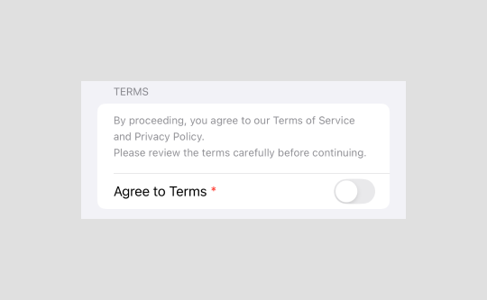
Section("Terms") {
    Text("""
    By proceeding, you agree to our Terms of Service and Privacy Policy.
    Please review the terms carefully before continuing.
    """)
    .font(.footnote)
    .foregroundColor(.gray)
    .padding(.bottom, 5)

    Toggle(isOn: $agreeToTerms) {
        Text("Agree to Terms") + Text(" *")
            .foregroundColor(.red)
    }
}
Text + Text for Highlighted Terms
SwiftUI enables combining multiple Text views using the + operator, allowing you to style different parts of a single line independently. For example:
– The first Text displays the standard label (“Agree to Terms”).
– The second Text appends a red asterisk * to highlight the required action.
Conclusion
In this tutorial, we explored SwiftUI’s basic controls and how they can be used to create a dynamic, user-friendly checkout form. By leveraging components like Picker, TextField, DatePicker, and others, you can build intuitive and visually appealing forms with minimal code.
You can find the the full code at Github 🚀
